-
Architects: Francesc Rifé Studio
- Area: 268 m²
- Year: 2021
-
Photographs:Montse Capdevila
-
Manufacturers: AutoDesk, Bulthaup, Carl Hansen and Son, Cassina, Milan Iluminación, Santa & Cole, Viabizzuno, e15

Text description provided by the architects. With the feeling of opening a chapter in the history of the German kitchen brand, softness, details, and warmth mark the new image of bulthaup Sant Cugat. Its new interior, more intimate and personal, is the result of the collaboration between the designer Francesc Rifé and the showroom’s owner and designer, Caterina Masferrer. "The idea behind the new design is to evoke family warmth and take the project towards a more domestic concept," they explain. More like a home than a business, more private than exposed, closer than impersonal. To achieve this, serene materials and a warm chromaticism have been selected rooted in the identity of bulthaup. The natural or stained oak in different tones is balanced with the concrete floors, while the neutrality of the walls and concrete ceilings shape most of the space.


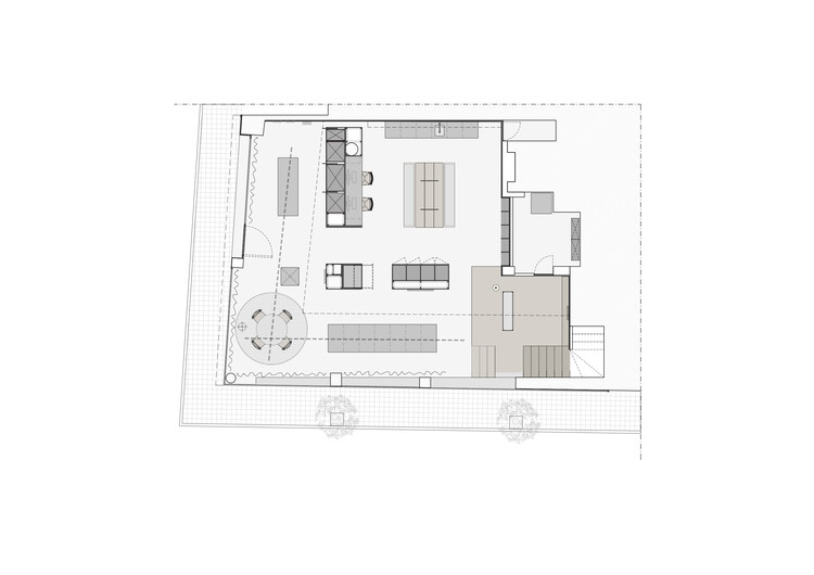
Neatly arranged and composed, the kitchens are distributed on two levels. The first, which combines a double-height area with a lower one, is presented as an atelier in which visitors can interact with the firm's materials and finishes. The opportunity is also offered to experience bulthaup furniture in a purely technical sense, delving into its structure and configuration. On the upper level, however, a much more personal scene of the home is represented through a selection of timeless and iconic furniture and objects. For a more connected spatial experience, this last environment is visually open to both the ground floor and the exterior through a glass enclosure framed in oak wood. Jobs are also distributed throughout the project, promoting cross-circulation between employees and customers.


With hardly any distractions, neither in shape nor in materiality, the staircase adapts to the shape of the space and its design is animated through subtle details. The final brushstroke comes with the use of large curtains that, once again, refer to the intimacy of the home while allowing the excess of natural light that enters from the facade to be controlled. A practical gesture that also seeks to add sensitivity to the atmosphere and a certain scenographic setting.


